Embedding high DPI screenshots at normal size in HTML
April 2, 2023
April 2, 2023
Since I moved to a Retina display, the screenshots I take are twice as big as before!
This is a problem because, when embedded in an HTML page, they look ginormous.
Let’s take a dummy example of some UI element screenshot:
<img alt="Save as popup" src="save-as-example.png">
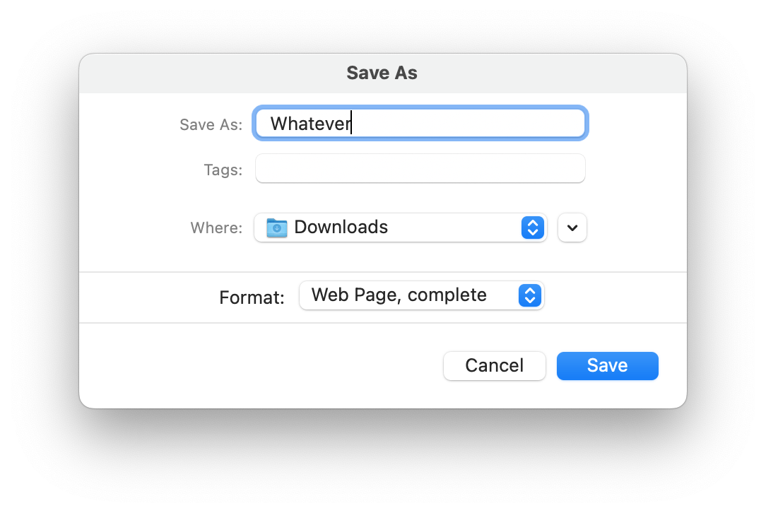
This is huge. Crazy huge. It disturbs the reading flow and you only see that oversized, slightly blurry image. Just bad.
How to fix it then?
We can resize the image by 50% before embedding it. For example using ImageMagick:
convert save-as-example.png -resize 50% save-as-example-small.png
This will work, but we introduce a loss in quality from the downscaling operation. It’s not gonna be as “sharp” as if the UI element was rendered at the lower resolution in the first place, without being downsized at the pixel level later on.
On top of that, when viewed on a high DPI screen, the image will not be as crisp as what you saw when you took the screenshot, because half the pixels got lost.
On macOS, if you have an external screen that has a low DPI, you can take the screenshot on that screen. Then the screenshot will be taken at a normal-looking native resolution, because there’s no scaling factor.
The downside is that you need a low DPI screen handy, and to plug it. Not always applicable.
And on top of that, like the previous method, it won’t look as good when viewed on a high DPI screen.
srcset with a 2x factor!If you want to go the lazy and easy way, srcset is the way.
It allows to specify a pixel density descriptor for the image being
referenced. In our case, because the screenshot was rendered at double
the size for the Retina display, we can specify 2x.
<img alt="Save as popup" srcset="save-as-example.png 2x">
This looks perfect! On a high DPI screen, we get the exact original quality of the screenshot, as crisp as can be. On a low DPI screen, the browser knows how to adapt the size of the screenshot to make it look just right.
The only downside is that for low DPI screens, we’ll still send the
heavier image with twice as much pixels, even if we don’t need it. If
that’s a problem for you, then you can use one of the earlier solutions
to generate a 1x version of the screenshot, and use it as part of the
srcset.
Note: I also use this technique from phone screenshots! Phones
typically have high DPI screens too, and they generate pretty large
screenshots. 2x might not be enough to make it look reasonable on a
web page, so feel free to go 3x or 4x if you want to reduce the size
of the image without altering the original and compromising its quality!